Green & Blue Screen — Rosco Chroma Key & DigiComp HD
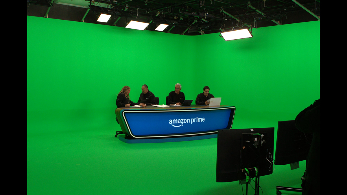
Rosco keying paint · green & blue screen
You need keying paint. This is the one worth building on.
Most people arrive here already sold on a green or blue screen — the real question is which paint will still be keying clean in five years. This is the difference between Rosco and every other “chroma” paint on the market, and how to choose the exact one for your studio.
Not just better than house paint — better than other keying paints
Why the pros build on Rosco
Even among paints that call themselves “chroma”, most are thin, low-pigment mixes that need coat after coat, drift between batches, and still leave your editor pulling a dirty key. Here's what actually sets Rosco apart.
Single-source pigment
Pure, saturated green or blue
One pigment, not a blue+yellow mix in a white base — more keyable colour bounces back, so you need less light and get cleaner separation.
Zero-sheen, ultra-matte
No hot spots to fight
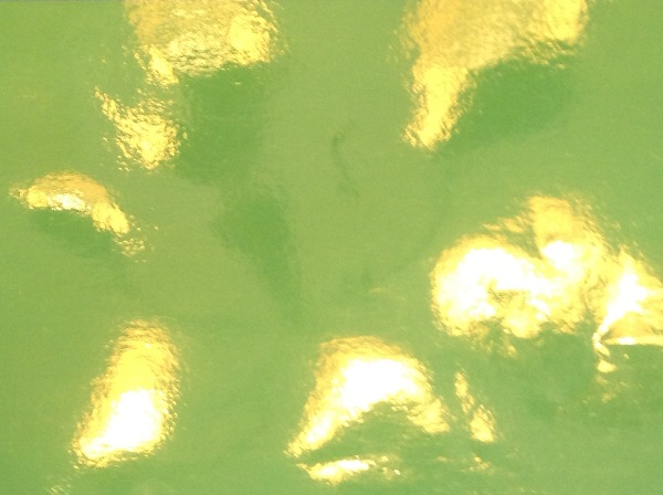
An ultra-flat finish that doesn't throw glare or bright patches under soft studio light — the wall reads as one even tone.
Dialled to the vectorscope
Made for the keyer, not the eye
Rosco's keying colours sit where digital keyers want them, so you get crisp edges, less spill and far less rotoscoping in post.
Even, keyable saturation in 2 coats
Not 3, not 4
High pigment load means two coats over primer gets you a consistent, keyable wall — thin, low-pigment paints often need three or four and still drift. If your surface is porous, a third coat may be needed — always test your own surface first, as every one varies.
Batch-to-batch consistency
Touch-ups that still match
Buy more next year and it keys like the wall you painted today — no re-doing the whole cyc because a patch reads different.
Industry standard, proven worldwide
Used where keys can't fail
The keying paint broadcasters, studios and VFX houses around the world build on — a known quantity, not a gamble.
The market problem
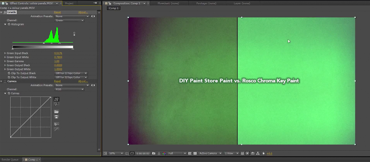
“Green-looking” is not the same as keyable
This is the comparison the forums keep having. A paint can look green in the room and still sit in the wrong place for the camera — weak separation, green spill, hours of roto.
Think of it as an investment
A keying wall is built once and shot on for years
The cheapest tin is rarely the cheapest wall. Fewer coats, faster keys and a surface that stays consistent is what pays you back — every coat, every shoot, every year.
2 coats
Less paint & labour up front
Fewer coats to lay means less product and less studio downtime before you're shooting.
Every shoot
Faster keys, less roto — forever
A clean, even wall pays back on every single production in post time saved. That's the dividend.
Years
Touch up, don't repaint
Consistent colour means you maintain the wall for years instead of stripping and starting again.
Step 1 · Choose your paint
Two Rosco keying ranges — which fits your workflow?
Both come in green and blue. Pick the range and we'll take you to the right colour, specs and coverage.
Chroma Key Paint
The purpose-made keying standard for green and blue screen studios — high saturation, ultra-matte, keys reliably in real-world rooms.
- Green (5711) & Blue (5710)
- Studios, broadcast, education & corporate
- 0.95L, 3.79L & 19L — test pot to full cyc
DigiComp® HD
Precision digital-compositing paint dialled to exact luminance & RGB targets — the cleanest separation and the least post clean-up for demanding pipelines.
- Digital Green (5751) & Digital Blue (5750)
- Virtual production, broadcast VFX, livestream
- 3.8L & 19L — pairs with keying tape
Not sure which range?
Tell us what you shoot and your post/VFX workflow, and we'll point you to Chroma Key or DigiComp HD, size the job and quote it.